
Latest Colour Palette Trends: Creating calm, luxury and emotional balance through colour
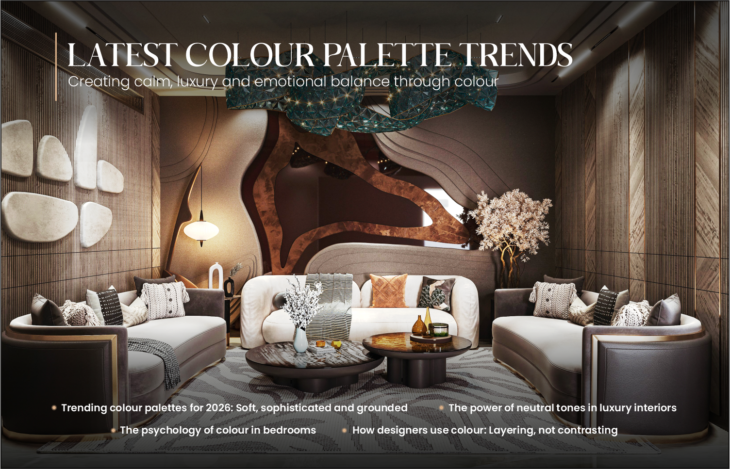
Colour is not just a visual choice, it is an emotional decision. In luxury interiors, colour defines the mood, the personality and the experience of a space. As we move into 2026, colour trends are shifting away from loud statements toward calm sophistication, tactile warmth and emotionally comforting palettes. The modern luxury home is now defined by subtlety, depth and timeless elegance.
This blog explores trending colours, the power of neutral tones and the psychology of colour, especially in bedrooms, where emotional comfort matters most.
1. Trending colour palettes for 2026: Soft, sophisticated and grounded
The biggest shift in colour trends is toward grounded, nature-inspired tones that feel calming and enduring rather than temporary.
Key trending colours
Warm greys and metal greys
These tones remain at the heart of luxury interiors. Unlike cold greys, modern greys have warm undertones that feel inviting and refined.
Muted greens
Soft sage, eucalyptus and bluish greens bring calmness and connect interiors with nature. These tones align beautifully with wood textures and fabric panels.
Earthy neutrals
Beige, taupe, sand and mushroom tones create warmth without overpowering the space.
Dusty blues
Soft, grey-based blues evoke tranquility and elegance, ideal for bedrooms and lounges.
Muted metallic undertones
Satin bronze, champagne gold and brushed metal finishes add subtle luxury without being flashy.
These palettes create spaces that feel timeless, calming and emotionally balanced.
2. The power of neutral tones in luxury interiors
Neutral tones are often misunderstood as “plain.” In reality, neutrals are the foundation of sophisticated design.
Why neutrals define luxury
Timeless appeal
Neutral palettes do not age quickly. They remain elegant for years.
Visual calmness
They reduce visual noise, allowing the mind to relax.
Material expression
Neutrals highlight textures like microconcrete, wood grains, fabric panels and stone.
Flexibility
They allow furniture, lighting and art to become focal points without overwhelming the space.
In luxury interiors, the beauty lies not in bold colour but in subtle layers of tone, texture and finish.
For example, combining:
- Cool grey walls
- Warm wood textures
- Fabric panels
- Satin metallic accents
creates depth without visual chaos.
3. The psychology of colour in bedrooms
Bedrooms are emotional spaces. The colour palette directly affects sleep quality, stress levels and emotional well-being.
Best bedroom colours for emotional comfort
Soft greys
Promote calmness, stability and mental clarity.
Muted blues
Reduce stress and help the mind relax.
Warm neutrals
Create emotional warmth and a sense of security.
Soft greens
Promote balance, healing and freshness.
These tones help the nervous system relax, making the bedroom feel like a retreat.
Colours to avoid in bedrooms
Bright red – Stimulates energy and can disrupt sleep
Harsh white – Feels clinical and emotionally cold
Overly dark shades – Can feel heavy and restrictive if overused
Luxury bedroom design focuses on soft transitions and layered tones, not sharp contrasts.
4. How designers use colour: Layering, not contrasting
True luxury is achieved through layering similar tones rather than creating strong contrast.
For example:
- Off white wall paint
- Slightly Grey-beigish fabric headboard
- Pastel brown upholstery
- Metal grey accent lighting
This creates depth, softness and harmony.
The space feels cohesive, calm and intentional.
5. The future of colour: Emotional luxury
The future of luxury interiors is not about boldness, it is about emotional comfort.
Clients today are moving toward spaces that feel:
- Calm
- Grounded
- Warm
- Timeless
- Personal
Colour plays the biggest role in achieving this emotional experience.
A well-chosen palette can make a home feel like a sanctuary.
Conclusion: Colour is the foundation of luxury living
Colour is the silent language of interior design. It influences how we feel, how we rest and how we experience our homes.
The 2026 colour trends reflect a deeper shift toward calm, timeless and emotionally intelligent interiors.
Luxury is no longer defined by excess, but by balance, softness and intention.
The right palette does not just make a home beautiful.
It makes it feel right.
Contact Us
-
E-983, 3rd Floor, Saraswati Vihar, Pitampura, Above Bank of Baroda,
New Delhi - 110034. - renugargdesign@gmail.com
-
+91-9717093053; +91-9818060909
+91 11 47018508
© 2026 renugargesign. Created for free using WordPress and Kubio